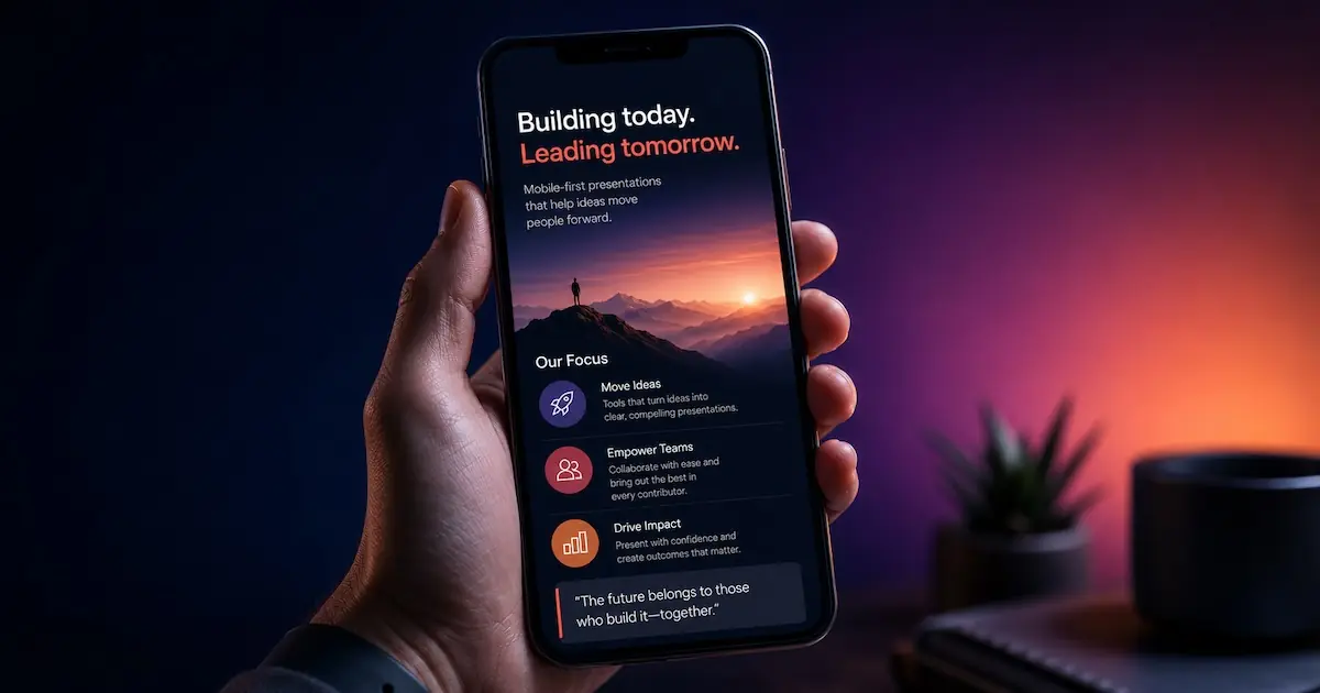
Every year brings a fresh batch of "presentation design trends" listicles: new fonts, new color palettes, a new opinion on gradients. But looking across what's actually changed in 2026, one shift stands above the rest: presentations have quietly become a mobile medium first and a stage medium second.
That's not a stylistic preference. It's a response to where decks are actually being opened.
The headline trend: vertical is the fastest-growing format
Across nearly every presentation design roundup this year, one claim keeps showing up: the vertical, 9:16 slide is the fastest-growing presentation category of 2026 (SlideEgg, Envato Elements). Decks are increasingly designed to be vertical, scrollable, and swiped through like an Instagram story rather than clicked through slide by slide on a projector.
The underlying behavior backs this up. Mobile now accounts for an estimated 82% of all global video views in 2026, up from 75% just two years earlier, and people hold their phones vertically about 94% of the time (AutoFaceless, Wyzowl). Vertical video also holds attention meaningfully better on a phone screen: reported completion rates run around 76% for vertical content versus 54% for horizontal, and the gap is even starker for ads: viewers stick with up to 90% of a vertical ad versus about 14% of a horizontal one on mobile (AutoFaceless, Medianug). Vertical (9:16) content is now reported to account for 58% of all video views across social platforms (Searchlab).
Presentations are following the same curve. Executives increasingly see a deck on a phone screen before they ever see it on a stage, which means a 16:9 file designed only for a projector is, functionally, designing for the wrong device first.
What a mobile-native slide actually looks like
Trend coverage converges on a consistent set of design principles for 9:16 slides: oversized type that's legible at arm's length, one idea per slide broken into swipeable sections, bold accent colors used to mark a point rather than decorate the page, simplified visuals instead of dense boardroom-style charts, and, critically, testing on an actual phone rather than just previewing on a laptop.
Here's the short version as a mobile-native flow you can swipe through right now:
The other trends worth knowing
Mobile-first is the headline, but it's not the only shift worth planning around this year:
AI-assisted design is now the default starting point. The AI presentation tools market is estimated at $4.7 billion in 2026, up 52% year over year, with enterprise adoption crossing 60% and consulting, education, and SaaS leading at over 75% (2Slides). Reportedly, 81% of business users now say AI-generated decks are ready to use with only minor edits or none at all. The practical effect: teams draft the first pass with AI and spend their own time on story and judgment calls, not laying out boxes.
Structured data storytelling is replacing the wall of bullets. Instead of dense bullet lists and copy-pasted spreadsheet tables, 2026 decks lean on one large stat plus a single clear takeaway, visuals matched specifically to the point being made, and motion used only to reveal a sequence, not to decorate.
Dark mode with dynamic color is the premium default. Dark backgrounds paired with one confident accent color read as modern and are easier on the eyes for phone viewing in low light.
Accessibility-first design is now a baseline expectation. Color contrast, alt text, and caption-ready video are treated as standard requirements rather than a compliance step added at the end.
Motion has to earn its place. The trend isn't more animation. It's purpose-driven motion paired with humanized visuals: real product shots and authentic screenshots over generic stock photography and clip art.
The takeaway
If there's one thing to change about how you build decks in 2026, it's this: stop treating vertical and mobile as an export afterthought. Build for the phone first, and let the stage keynote or a PDF handout follow from that same story. That's the direction the data and the tools are already moving.
This is exactly why we built Flow2 to be vertical-first from the ground up: your deck is ready for the screen it's actually going to be seen on.